
Understanding Grid Systems in Web Design
Learn how grid-based layouts create structure and consistency across pages. Grids are the invisible framework that makes modern design work.
Read ArticleSize, color, and position communicate importance. Master the principles of visual hierarchy to create pages that guide visitors naturally toward key content and actions.
When you land on a website, your eye doesn’t just wander randomly. It follows a path. That path isn’t accidental — it’s designed. Visual hierarchy is the practice of organizing information so visitors naturally focus on what matters most. Without it, every element screams for attention equally, and nothing gets heard.
Think of it like a newspaper. The headline’s huge, the subheading’s medium, and the body text’s smaller. You don’t need instructions to know what to read first. That’s visual hierarchy working. On websites, it’s exactly the same principle but applied across color, size, contrast, whitespace, and position.
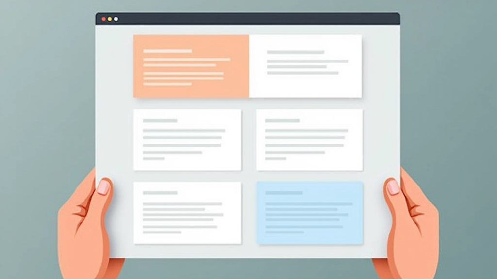
The biggest element on your page wins attention first. That’s not subjective — it’s how human eyes work. But here’s where it gets interesting: you don’t need huge jumps between sizes. A headline at 32px and body text at 16px creates clear distinction without feeling aggressive. The ratio matters more than the absolute size.
Most websites use three size levels: primary (headlines), secondary (subheadings and important text), and tertiary (supporting information). That’s the minimum. You can add more, but don’t. Extra levels create confusion. Keep it simple. When visitors scan your page in 3-5 seconds, they should instantly understand what’s what.

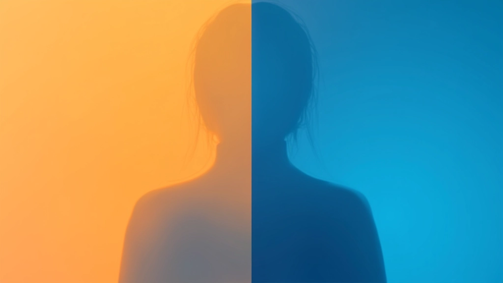
Color isn’t decoration — it’s direction. A bright accent color pulls the eye immediately. That’s why call-to-action buttons work. They’re usually bright, saturated, and different from everything else on the page. Your visitor’s brain processes this instantly: “That’s important. I should click it.”
But here’s the critical part: contrast matters more than brightness. A dark blue button on a dark background? Invisible, even if it’s vibrant. A light button on light background? Same problem. You need at least a 4.5:1 contrast ratio between text and background to pass accessibility standards. That’s not just nice — that’s necessary.
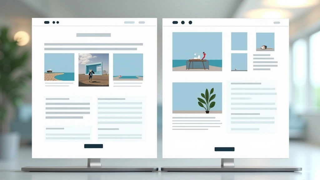
Where something sits on a page affects how important it seems. The top-left corner? That’s where eyes land first in left-to-right languages. The center? That feels balanced and important. The bottom? That’s supporting information. Most people won’t scroll to see it unless they’re genuinely interested.
Your hero section — the first thing visitors see — should contain your most important message. Navigation comes second. Main content third. That hierarchy of placement guides attention down the page naturally. You’re not forcing anyone to look; you’re creating a visual path they want to follow. When a layout feels logical, visitors stick around longer.
Theory’s useful, but application’s what counts. Here’s how to actually implement visual hierarchy on your pages.
Decide what’s primary, secondary, and tertiary. Usually that’s headline, supporting text, and details. Assign consistent sizes and colors to each level. Don’t deviate. Consistency trains visitor eyes to understand your structure immediately.
Whitespace around an element makes it feel more important. That empty space is like a spotlight. Use it to isolate key messages. A headline surrounded by whitespace commands attention far more than one crammed between other elements. Breathing room = emphasis.
Don’t make everything bright and colorful. That’s chaos. Use contrast where it matters: buttons, important links, key statistics. When everything stands out, nothing does. Restraint creates impact.
Squint at your design. If you can’t read the hierarchy with your eyes half-closed, visitors won’t get it at full attention. The structure should be instantly obvious. If someone glances at your page for two seconds, they should know what matters most.
Visual hierarchy fails when you try to make everything important.
If you’re using six different font sizes, visitors can’t tell which is most important. Stick to three or four maximum. Consistency beats variety every time.
Bright colors everywhere mean bright colors nowhere. You want one or two accent colors that pop against neutral backgrounds. That’s what makes them work.
Cramming content densely doesn’t save space; it wastes attention. Whitespace is free real estate. Use it to guide focus.
Every page needs one main goal. If you’re not sure what you want visitors to do, they won’t be either. Make your primary action obvious through size, color, and position.
Visual hierarchy isn’t about making things pretty — it’s about making things clear. When visitors land on your page, they’re busy. They’ve got ten other tabs open and about three seconds to decide if your page is worth their time. A strong visual hierarchy answers that question immediately: “Yes, I see what this is about, and here’s what matters most.”
The best websites don’t feel designed at all. They feel natural. Visitors navigate without thinking about it because the hierarchy’s so intuitive. That’s the goal. Every element — every size choice, every color, every bit of whitespace — works together to guide attention. That’s not luck. That’s intentional design.
Start with your three hierarchy levels. Apply them consistently. Use whitespace generously. Test by squinting. That’s the foundation. From there, everything else is refinement. You’ve got this.
Explore our complete guide collection on modern web design principles and learn how to create pages that convert.
Browse More Guides

This article provides educational information about visual hierarchy principles and web design best practices. The concepts and guidelines presented are intended for learning and reference purposes. Design decisions should always be adapted to your specific audience, brand identity, and business objectives. Visual hierarchy principles work best when combined with user research, accessibility standards, and clear business goals. Every website is unique, and what works for one site may need adjustment for another.