Understanding Grid Systems in Web Design
Learn how grid-based layouts create structure and consistency across pages. We break down 12-column grids, flexible units, and when to break the rules.
Read ArticleLearn the fundamentals of modern web design through practical principles of grid-based composition, visual hierarchy, and strategic whitespace utilization. Resources crafted for designers and developers in Malaysia and beyond.
Every website tells a story. The way you structure that story — through grid systems, visual hierarchy, and whitespace — determines whether visitors understand your message or get lost in the noise.
We’ve created this resource hub because too many websites waste potential. You see it everywhere: cluttered layouts, weak hierarchy, no breathing room. It doesn’t have to be that way. Master the principles, and you’ll create layouts that guide users naturally, communicate clearly, and feel genuinely professional.
This isn’t theory for theory’s sake. We’re focusing on practical, applicable principles that work across industries — from corporate websites to e-commerce platforms to digital portfolios. You’ll learn how the best sites in the world approach composition, and you’ll be able to apply those same techniques to your own projects.

Four fundamental concepts that separate great layouts from average ones
Structure your content with 12-column grids. Learn how flexible units, breakpoints, and proportional spacing create consistency across pages and devices.
Size, color, position, and weight communicate importance. Understand how to guide user attention naturally toward key content and calls-to-action.
Negative space isn’t empty — it’s breathing room. Master how margins, padding, and breathing room improve readability and create premium feel.
Symmetry and asymmetry, contrast and harmony. Learn compositional techniques that make layouts feel intentional and professionally designed.
Font hierarchy, line height, and sizing ratios. Discover how to create readable, beautiful text layouts that enhance your design.
Design once, adapt everywhere. Understand mobile-first principles and how to maintain your composition across all screen sizes.
Our resources are built for designers, developers, and anyone responsible for web presence. We don’t assume you’re starting from zero, but we don’t assume expertise either.
12-column grids, CSS Grid vs Flexbox, proportional scaling, and when to break the grid for creative effect.
Using size, color, position, and weight to communicate importance naturally, without resorting to visual gimmicks.
Strategic margins and padding that improve readability, create visual focus, and make designs feel premium.
Examples from corporate sites, portfolios, e-commerce, and more. See principles in action on sites you recognize.
Modern design works on all devices. Learn how composition adapts from mobile to desktop without losing integrity.
Not just what to do, but why. Understand the reasoning behind layout decisions so you can apply principles to any project.

Start with these core topics to build your foundation

Learn how grid-based layouts create structure and consistency across pages. We break down 12-column grids, flexible units, and when to break the rules.
Read Article
Whitespace isn’t empty space — it’s breathing room. Discover how strategic spacing improves readability, guides user attention, and makes your design feel premium.
Read Article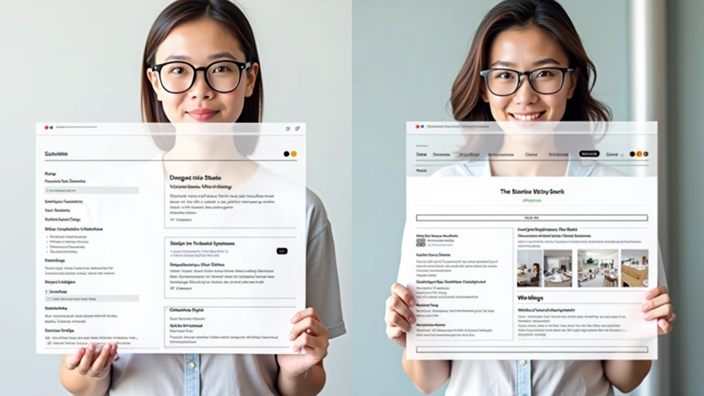
Size, color, and position communicate importance. Master the principles of visual hierarchy to create pages that guide visitors naturally toward key content and actions.
Read ArticleA structured approach to mastering modern web design
Start with grid systems and basic composition. Understand the rules before you think about breaking them. We cover 12-column grids, flexible units, and responsive thinking.
Learn how size, color, weight, and position guide attention. Create layouts where the most important content stands out naturally without feeling forced or artificial.
Discover the power of breathing room. Understand margins, padding, and negative space as active design tools that improve readability and create professional polish.
Take what you’ve learned and apply it. See how principles work across different industries and screen sizes. Practice composition on actual design briefs.
Real feedback from people using these resources
“I wasn’t confident with my layout decisions before. Now I’ve got a framework — understand the grid, think about hierarchy, use whitespace deliberately. Applied these principles to our company site redesign and it’s night and day. Actually feels professional.”
“The whitespace module changed how I approach design. I’d always crammed content because I thought empty space was wasting real estate. Now I see it’s the opposite — breathing room makes everything clearer. My portfolio sites look way better.”
“We’re building an e-commerce platform and these resources were invaluable. The hierarchy principles especially — we restructured our product pages and conversion went up. Don’t know if it’s causation but the design definitely feels more intentional now.”
Everything you need to know about the resources
Not at all. We’ve structured everything for beginners through intermediate designers. If you’re new to web design, start with the grid systems module. If you’re already designing, jump to visual hierarchy and whitespace principles. Each module stands alone but builds naturally from fundamentals.
The principles are universal — they work across every industry and every market. We’ve included examples from Malaysian businesses and global sites. The fundamentals of grid-based design, visual hierarchy, and whitespace apply whether you’re designing for a Kuala Lumpur startup or an international brand.
Yes — absolutely. Modern layout design means responsive thinking from the start. All our modules cover mobile-first approaches, responsive grids, and how composition adapts across devices. These aren’t desktop-only principles.
Everything’s available online, 24/7. Browse individual articles, explore the full learning path, or jump to specific topics. It’s designed for self-paced learning — study when you have time, at your own speed.
Both. Developers benefit from understanding design thinking and composition principles. You’ll write better CSS, build more flexible components, and create layouts that actually serve the design. Designers benefit from understanding responsive constraints and how code affects what’s possible.
Yes. Share links to specific articles with colleagues. We encourage learning in teams. If you’re building a design system or training internal standards, these resources work as a reference foundation.
Start learning modern design principles today. Explore our full resource library or get in touch if you have questions about how these principles apply to your specific projects.