Understanding Grid Systems in Web Design
Master the invisible structure that holds every professional website together. Learn how grid-based layouts create consistency, hierarchy, and visual rhythm across your pages.

Why Grids Matter More Than You Think
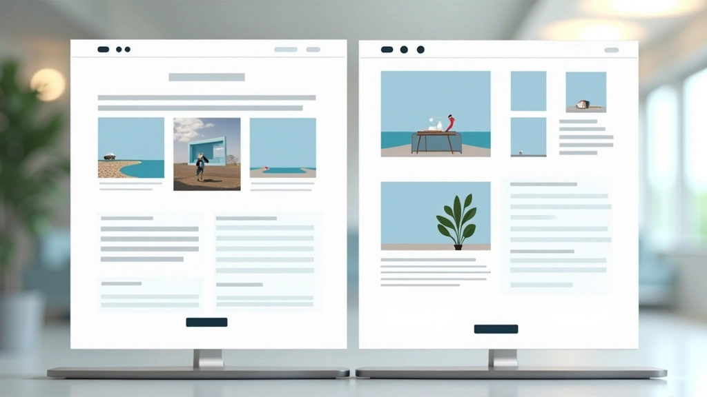
You’ve probably scrolled through a website and felt like something just “worked” — elements lined up perfectly, spacing felt balanced, and everything seemed to flow naturally. That’s not magic. That’s a grid system doing its job behind the scenes. It’s the invisible framework that separates amateur websites from polished, professional ones.
Think of a grid like the graph paper architects use. Without it, buildings would be crooked and confusing. The same principle applies to web design. A grid system gives your website structure, consistency, and purpose. It’s the difference between a page that feels intentional and one that feels scattered.

The 12-Column Grid: The Industry Standard
Most professional designers use a 12-column grid. Why twelve? Because it’s incredibly flexible. You can divide twelve into halves (6 + 6), thirds (4 + 4 + 4), quarters (3 + 3 + 3 + 3), or even leave some columns empty for whitespace. This flexibility makes it perfect for creating layouts that work across different screen sizes.
A typical 12-column grid has gutters — the spaces between columns. These gutters create breathing room and prevent your content from feeling cramped. Standard gutter widths range from 16 to 32 pixels, depending on your overall design. The container itself (the outer boundary holding everything) usually has a max-width between 1200 and 1440 pixels on desktop, ensuring text remains readable.
Pro tip: Your grid’s column width, gutter size, and container width should all work together. If your columns are too narrow or gutters too large, your layout will feel disconnected. Test on actual devices, not just in design software.


Making Grids Responsive: From Desktop to Mobile
Here’s where grids become powerful. On a 1200px desktop, you might display three content blocks side by side using a 4-column layout (4 + 4 + 4 = 12). On a tablet at 768px, you might stack them to two columns (6 + 6 = 12). On a phone at 375px, everything becomes single-column. Same grid, different arrangement.
This isn’t random shuffling — it’s strategic thinking about how content adapts. Your grid system should have breakpoints (specific viewport widths) where the layout changes. Common breakpoints are 768px for tablets and 1024px for desktops, though you’ll adjust these based on your actual content needs.
Three Essential Breakpoints:
- Mobile (320–767px): Single column, full-width blocks, simplified layouts
- Tablet (768–1023px): Two columns, reduced gutters, optimized spacing
- Desktop (1024px+): Full 12-column grid, generous whitespace, multi-column layouts
Using Grids to Create Visual Hierarchy
A grid doesn’t just organize space — it guides how people read your page. By strategically using full-width elements, partial-width blocks, and whitespace, you create a visual path. Your most important content should command attention, either through size, position, or the grid columns it spans.
For example, a hero section might span all 12 columns. A headline might span 8 columns with 2 columns of margin on each side. Supporting text might take 6 columns. This isn’t accidental — it’s deliberate use of your grid to communicate importance and guide the viewer’s eye down the page in the order you’ve planned.
“A grid is more than alignment. It’s a communication tool that tells viewers where to look and what matters most on your page.”
— Design principle
Grid Systems in Action: Real-World Examples
Understanding the theory is one thing. Seeing how professional sites actually use grids is another. Here’s what you’ll notice when you start looking:
News Sites & Publications
Publications like medium.com use strict grids with a narrow reading column (usually 600–700px) centered on the page. This keeps text at a comfortable reading width. Sidebar content, ads, and navigation sit in their own grid columns, creating clear visual zones.
E-Commerce Layouts
Online shops use grids to create product galleries. A 4-column grid on desktop becomes 2 columns on tablet and 1 on mobile. The consistent spacing and alignment make browsing feel organized, even when there are hundreds of products.
Portfolio & Creative Sites
Designers often break their own grids strategically — using full-width images, overlapping elements, or asymmetrical layouts. But even these “rule-breaking” sites usually have an underlying grid structure. They’re breaking the rules intentionally, not ignoring the rules entirely.
SaaS & Corporate Sites
Business websites rely heavily on grids for credibility and clarity. Consistent column widths, predictable spacing, and organized layouts make these sites feel trustworthy and professional. Content follows strict grid rules to maximize readability.
Tools & Frameworks for Building Grids
You don’t need to reinvent the wheel. There are proven tools and frameworks that handle grids for you:
CSS Grid & Flexbox
Modern CSS lets you create grids directly in code. CSS Grid is powerful for complex layouts, while Flexbox is ideal for component-based designs. Both are supported across all modern browsers.
Bootstrap
Bootstrap’s 12-column grid is battle-tested and widely used. It handles responsive behavior automatically and includes pre-built components that follow the grid structure.
Tailwind CSS
Tailwind provides utility classes for building custom grids quickly. It’s more flexible than Bootstrap and lets you define your own grid settings for complete control.
Design Tools
Figma, Adobe XD, and Sketch all have grid features built in. Use these when designing to ensure your mockups align with your actual grid system before coding.
When to Break the Grid (And When to Stick to It)
Here’s the secret most designers won’t tell you: the best way to break grid rules is to understand them first. A website that follows its grid perfectly feels organized and trustworthy. A website that breaks the grid strategically — like a full-width hero image or an asymmetrical layout — feels creative and intentional. But a website with no grid at all just feels chaotic.
Start with a solid grid. Build your site following it consistently. Once everything feels balanced and works well, then you can experiment with strategic rule-breaking. Maybe that one section spans 8 columns instead of 6. Maybe you pull a headline outside the container for dramatic effect. These choices matter because you’re making them intentionally within a structured framework.
Key Takeaways
- A grid system provides structure and consistency across your entire website
- The 12-column grid is the industry standard for good reason — flexibility and simplicity
- Responsive grids adapt your layout across devices using breakpoints
- Visual hierarchy comes from strategic use of grid columns, not random sizing
- Tools like CSS Grid, Bootstrap, and Tailwind make building grids easier than ever
- Master the grid before you break it — that’s when real design happens
Explore More Design Fundamentals


Educational Note
This article provides educational information about web design grid systems and layout principles. The guidelines, examples, and recommendations are based on widely-accepted design practices and standards. Individual projects may require adjustments based on your specific requirements, audience, and brand guidelines. Design principles evolve, and best practices vary depending on your use case. Consider consulting with professional designers for complex projects requiring custom solutions tailored to your unique needs.