Understanding Grid Systems in Web Design
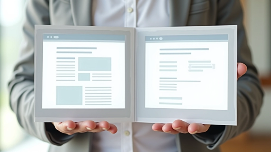
Learn how grid-based layouts create structure and consistency across pages. We break down column systems, gutters, and how to use them effectively.
Read ArticleBalance isn’t about symmetry — it’s about visual weight distribution. Learn how to arrange text, images, and elements so pages feel stable and intentional.
You’ve probably felt it before — that sense when you land on a website that just *feels right*. Nothing’s screaming at you. The layout doesn’t feel cramped or empty. Your eyes know where to look next. That’s balance at work.
But here’s the thing: balance isn’t about making everything symmetrical or equal. It’s about distributing visual weight so the page feels stable. A single heavy image on the left can balance three lighter text blocks on the right. It’s more art than math, though there are definitely principles you can follow.

Each creates a different feel and works best in different contexts.
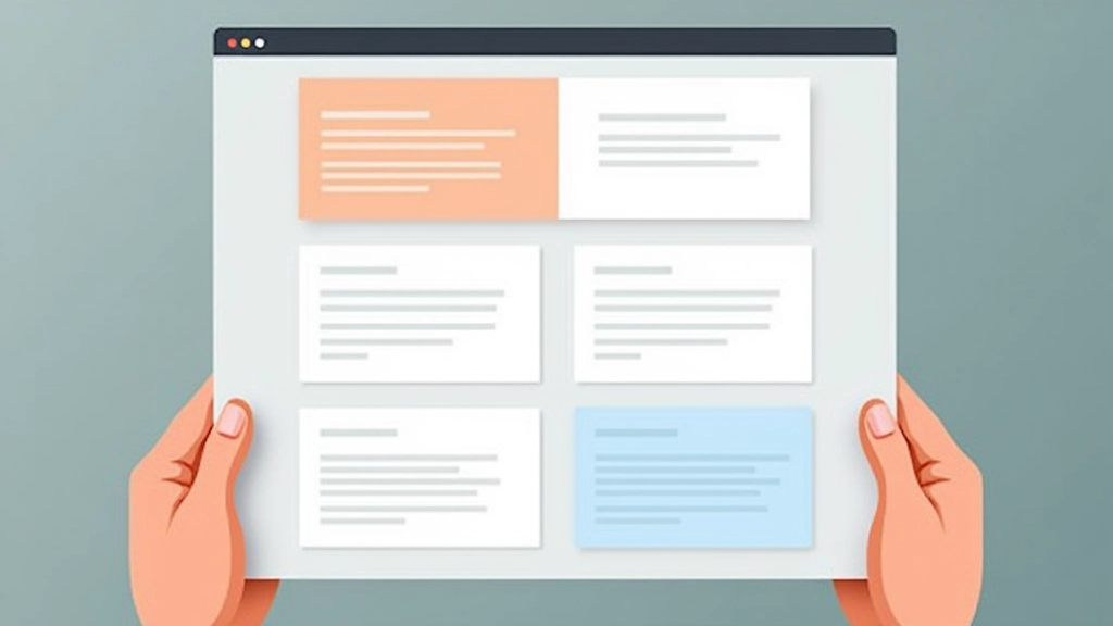
Mirror image on both sides. Left side matches right side. It’s formal, stable, and feels professional — think corporate websites and traditional layouts. You’ll see it a lot in financial services and luxury brands.
Different elements on each side, but the overall weight feels equal. This is where most modern design lives. One large image might balance three smaller text blocks. It’s dynamic, engaging, and honestly — it’s what makes pages feel alive.
Elements arranged around a center point. Less common in web design but powerful when used right. Think hero sections with a central focal point and elements radiating outward.
Everything on your page has visual weight. Larger elements feel heavier than smaller ones. Dark colors feel heavier than light ones. High-contrast elements pull attention more than subtle ones. Images feel heavier than text.
Here’s what makes it practical: if you place a large, dark image on the left side, you’ll need visual “weight” on the right to balance it. That could be a medium-sized image, or it could be a cluster of text blocks, or a strong call-to-action button. You’re not counting pixels — you’re feeling the visual equilibrium.
Most designers work intuitively here. You place something, step back, and ask: does this feel right? After you’ve done it a hundred times, you develop an instinct for it. But the underlying principle stays the same — distribute weight so no single side dominates the page.
Whitespace (or negative space) isn’t wasted space. It’s the breathing room that makes balance possible. Without it, even a well-distributed layout feels suffocating.
Think about it: if you pack your page with content edge-to-edge, everything feels heavy. But give elements room to breathe — space between sections, padding inside cards, margins around images — and suddenly the page feels balanced even if the content distribution isn’t perfectly symmetrical.
We’re talking about margins between sections (3-6 rem depending on scale), padding inside containers (1-2 rem), and gaps between related elements. These aren’t decorative choices. They’re structural. They literally create balance by separating visual weight.
Try these techniques on your next project.
List everything on your page. Images, text blocks, buttons, decorative elements. Rate their visual weight: heavy (images, dark colors), medium (text blocks, mid-tone colors), light (subtle text, white space). This gives you a visual inventory to work with.
Decide where you want attention. Usually the hero section, or maybe a key feature section. Make that area heavier visually (larger, darker, more contrast). Balance it elsewhere with lighter visual weight distributed differently.
Don’t just fill empty space. Use it to separate sections and create rhythm. Larger gaps between major sections, smaller gaps between related items. This creates visual hierarchy and makes balance obvious.
Balance shifts with viewport size. What feels balanced on desktop might feel cramped on mobile. Test constantly. Adjust spacing, reorder elements, and always prioritize readability over perfect symmetry.
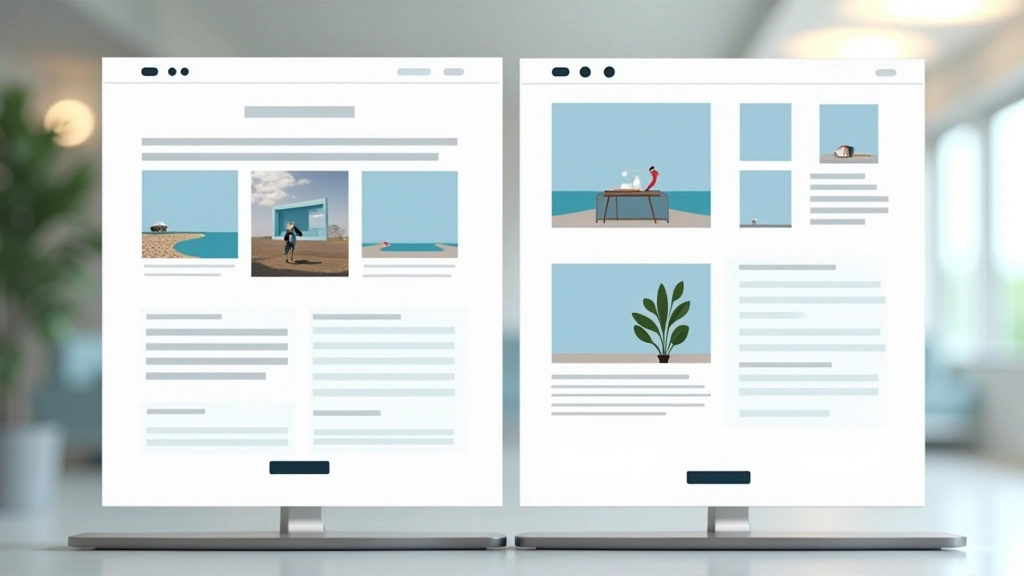
You’ve probably heard this from designers. Use 60% of your space for primary content (main text, hero image), 30% for secondary content (supporting images, secondary text), and 10% for accent elements (buttons, highlights, decorative touches).
It’s not a hard rule — it’s a starting point. But it works because it naturally creates balance. The 60% area gets your attention. The 30% supports it. The 10% adds personality without overwhelming. On a business website, that might look like a full-width hero (60%), two supporting feature sections (30% combined), and accent colors throughout (10%).
The magic is that these proportions create visual equilibrium. Your eye travels the page naturally. Nothing feels cramped or empty. It’s balanced.

Building balanced pages isn’t about following rigid rules. It’s about understanding how visual weight works and distributing elements so the page feels intentional. Whether you’re using symmetrical balance for a formal corporate site or asymmetrical balance for a creative portfolio, the principle stays the same: every element has weight, and weight needs distribution.
Start by thinking about your content. What’s most important? Make that heavy visually. What’s supporting? Make that lighter. Where do you want breathing room? Add whitespace. Then step back, look at the whole page, and ask: does this feel balanced?
That instinct — that feeling that something looks right — that’s what balance is. And once you understand it, you’ll start seeing it everywhere.
This article provides educational information about web design principles and layout composition. While these guidelines are based on established design practices, individual results vary based on context, audience, and specific project requirements. The examples and techniques described are intended for learning purposes. Always test your designs with real users and adjust based on their feedback. For specific design projects, consider consulting with a professional designer who can assess your unique needs.