Whitespace: The Most Underrated Design Tool
Whitespace isn’t empty space — it’s breathing room. Discover how strategic spacing improves readability, guides user attention, and makes your design feel premium.

Why Designers Keep Getting It Wrong
Here’s the thing: most websites feel cramped. Text bunches together, buttons huddle in corners, and images compete for attention. You’ll see it everywhere — especially on business sites trying to cram too much onto every page.
But the best-designed websites you’ve ever visited? They feel different. Calm. Intentional. Easy to scan. That’s not luck. That’s whitespace working behind the scenes. It’s the silent architect of every page that actually feels good to use.

What Actually Is Whitespace?
Whitespace — also called negative space — is the empty area around and between elements. It’s not literally white. It could be any color, any texture. What matters is that nothing’s there. No text, no images, no buttons.
Most people think it’s wasted space. A designer tells a client “we can fit more content here” and the client wants to fill every pixel. But you’ll see it on Apple’s website. On premium brand sites. On luxury product pages. They’re using whitespace because it works. It tells viewers “this is valuable, take your time, breathe.”
The math is simple: more breathing room = less cognitive load. Your brain doesn’t have to work as hard to understand what matters. Less visual noise means more focus on what actually counts.
Three Ways Whitespace Changes Everything
Readability Shoots Up
Dense text blocks are brutal. Your eyes get tired. But add padding around paragraphs, increase line spacing to 1.6 or 1.8, give headers room to breathe — suddenly people actually read your content. Tests show users spend 20-30% more time on pages with proper spacing.
Attention Naturally Flows
You don’t need flashy colors or animations to guide eyes. Whitespace does it quietly. When something stands alone with space around it, that’s where people look first. It’s like a spotlight that doesn’t feel pushy. Designers call this “visual hierarchy” — whitespace is half the equation.
It Feels Premium
Ever notice luxury brands don’t fill their pages? High-end fashion sites, luxury car websites, upscale hotels — they all leave space empty. Whitespace signals confidence. It says “we don’t need to convince you with clutter.” That restraint feels expensive and trustworthy.
Using Whitespace in Real Designs
This isn’t theoretical stuff. You can implement these today. Start with your margins and padding. Most websites use margins between 1-2 rem (16-32px on desktop). Increase that to 2-3 rem. It feels different immediately.
Line height matters too. Body text at 1.4 feels tight. Push it to 1.6 or 1.8. For headings, go even wider — 1.2 is good. Between sections? Give yourself 3-5 rem of vertical space. Don’t be afraid to leave things empty.
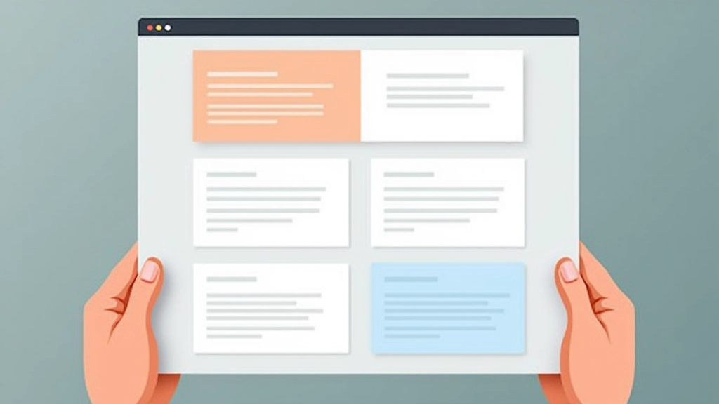
Cards and containers need breathing room inside them. If your card has text and an image, don’t make them touch. Use 1.5-2 rem of padding on all sides. That internal whitespace is what makes cards feel designed, not just like boxes with stuff in them.

Beyond Basic Spacing
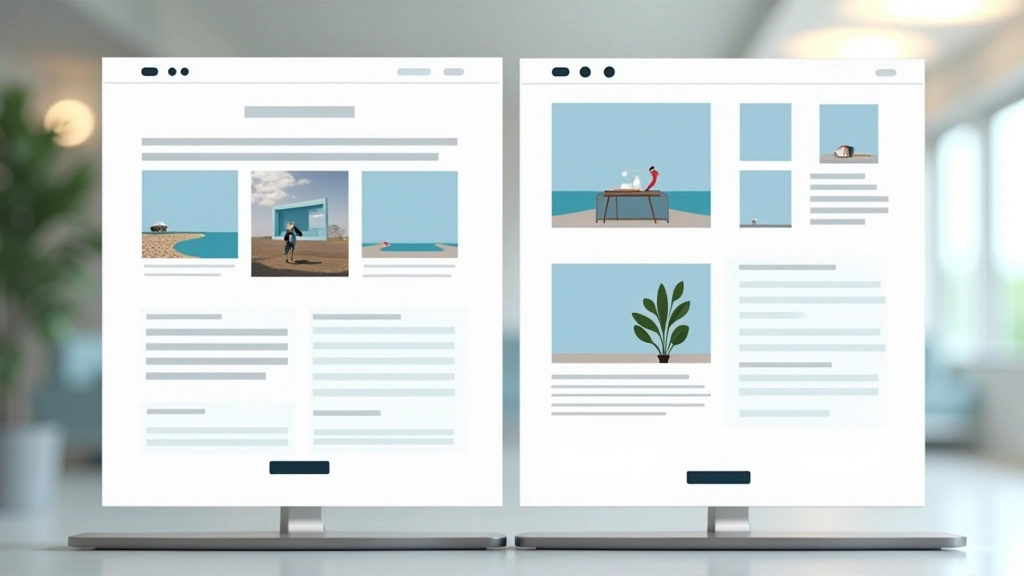
Once you’ve got the basics down, whitespace gets more strategic. Think about how you’re organizing information. Large whitespace between major sections creates natural breaks — viewers understand these are separate ideas. Smaller gaps within a section keep related content together.
Asymmetry matters too. A 70/30 layout with text on one side and plenty of empty space on the other? That’s more interesting than centered layouts, and the whitespace becomes part of your design statement. It’s not just breathing room anymore — it’s a design choice.
The Real Design Power
Whitespace isn’t about leaving things empty. It’s about intention. Every bit of space you add is a design decision. It’s saying “this matters” or “here’s where your eye should rest.” When you use it right, users don’t notice it. They just notice your design feels better, reads easier, and looks more professional.
Start today: take one website you’re working on. Add 20% more padding to your containers. Increase line height by 0.2. Add an extra 1 rem of margin between sections. Don’t fill the space. Leave it. You’ll be surprised how much better it feels.
Continue Learning

Important Disclaimer
This article provides educational information about design principles and whitespace usage. The guidelines, measurements, and recommendations shared are based on common design practices and general principles. Every project, audience, and context is unique — what works for one design may need adjustment for another. We recommend testing whitespace adjustments with your actual users and gathering feedback. Design is iterative, and there’s rarely a one-size-fits-all solution. Consider your specific brand, audience preferences, and accessibility requirements when implementing these principles.